Gnuplot can take an input with a .gnu extension.
To run a gnuplot script, do:
$ gnuplot name-of-input.gnu
The first encountered error, if any, will be printed to the Terminal. The script stops running with the first error, which is why subsequent errors are not reported.
In gnuplot, you need to explicitly set the font encoding to allow for special characters and symbols, such as Greek letters. The encoding line that has been used for everything in this guide is the ISO Latin 1 encoding, with the input command:
set encoding iso_8859_1
While there are lists available on the Internet, some common symbols for graphs are included in the table below.
Table: Some symbol codes for ISO encoding
| Symbol Name | Symbol | Gnuplot Symbol Code |
|---|---|---|
| Angstrom | Å | {\305} |
| Degree | ° | {\260} |
| Greek alpha | α | {/Symbol a} |
| Greek chi | χ | {/Symbol c} |
| Greek zeta | ζ | {/Symbol z} |
Commands in gnuplot can continue across lines when , \ is placed at the
line end.
An argument is ended by using a return, or with the semicolon when following
lines that ended with , \.
Comments are the same as bash shells and Python, where they’re initiated with
#.
Comments don’t work very well if you’re commenting in the middle of a plot
command, and it is thus advised that any plot lines you want to comment out are
moved to the place after the semicolon.
Multiple graphs can be created with one input, as seen earlier.
Setting the Terminal Type
There are two very helpful file types to generate gnuplot images with. These are postscript and pngcairo. Postscript is used with the .eps extension and is useful in that it requires minimal formatting–everything is typically scaled appropriately. The downside of using postscript is that the images are written in a different formatting language, and they will need to be converted manually to a .png or .pdf using commands such as:
$ for file in *.eps; do convert $file ${file%.*}-eps-converted-to.pdf; done
$ for file in *.eps; do convert $file -rotate 90 ${file%.*}.png; done
The postscript file format also doesn’t allow for image transparency.
Using pngcairo (which will likely require an administrator to run
sudo apt install libcairo2-dev) means that the image won’t be scaled right
off, but the resolution will likely be better than a converted .eps.
Pngcairo also allows for image transparency and more advanced coloration
features.
Setting the image type is known as setting the output terminal. For postscript, a line like:
set term postscript enhanced color font "Arial,24";
would set the terminal using an enhanced postscript format (enhanced allows for better coloration and more difficult line types) with 24 pt Arial font.
For pngcairo, a line like:
set term pngcairo enhanced color font "Arial,24" size 750,525;
would set the terminal using an enhanced png format (enhanced allows for better coloration and more difficult line types) with 24 pt Arial font at a size of 750 x 525 pixels (corresponding to 5 x 3 inches).
Labels, Keys, and Arrows
Axis labels and keys are set with rather straight-forward command types. Each of the label types in gnuplot also allow for offsetting, which can be especially helpful for keys. Some examples include:
set xlabel "Shift Degrees ({\260})"
set ylabel "Slide Degrees ({\260})"
set key top left font "Arial,20" width -1 height 1
set key outside right Left reverse width 2 height 1 font "Arial,18" maxrows 3
The individual argument structure can be found
in the documentation, or by
using the help command interactively.
The tic mark labels can also be forcefully set.
This trick is helpful for changing PDB residue numbers to match the actual protein residue numbers.
You can use a mix of both the number and words in the tic marks, too.
The bottom x labels are xtics and the top x labels are x2tics.
set xtics ("Initial" 0, 5, 10, "Next" 20, 45, "Hour" 60, "End" 80) border nomirror out;
set x2tics border nomirror out rotate by 15 ("Heat" 45)
set label 1 "Stir" at 15,25 font ",18"
You can place arrows on your graph at set positions.
The important word there is set–if they’re not positioned in a place that will
show up during autoscaling, they will not be visible.
The default arrow includes one arrowhead.
That can be changed to none or both with nohead or heads, respectively.
set arrow 1 from first 16,54.25 to first 17,60.00 lc rgb "#00853E"
set arrow 2 from first 1,65.25 to first 1,60.25 lw 1.2 lc rgb "#00853E"
set arrow 3 from first 334,10 to first 346,10 lw 2 nohead
set arrow 4 from first 334,9 to first 334,11 lw 1 heads
Once labels are unneeded or unwanted, you can use commands like unset key and
unset arrow 1 to remove them from the plotting area.
Different Graph Styles
There are multiple plot styles afforded by gnuplot.
Some examples include plotting with boxes (useful for EDA plots; w boxes),
points (useful for backbone angles; w points), lines (useful for distances;
w lines) and smoothed lines (useful for almost everything else;
w lines s bezier).
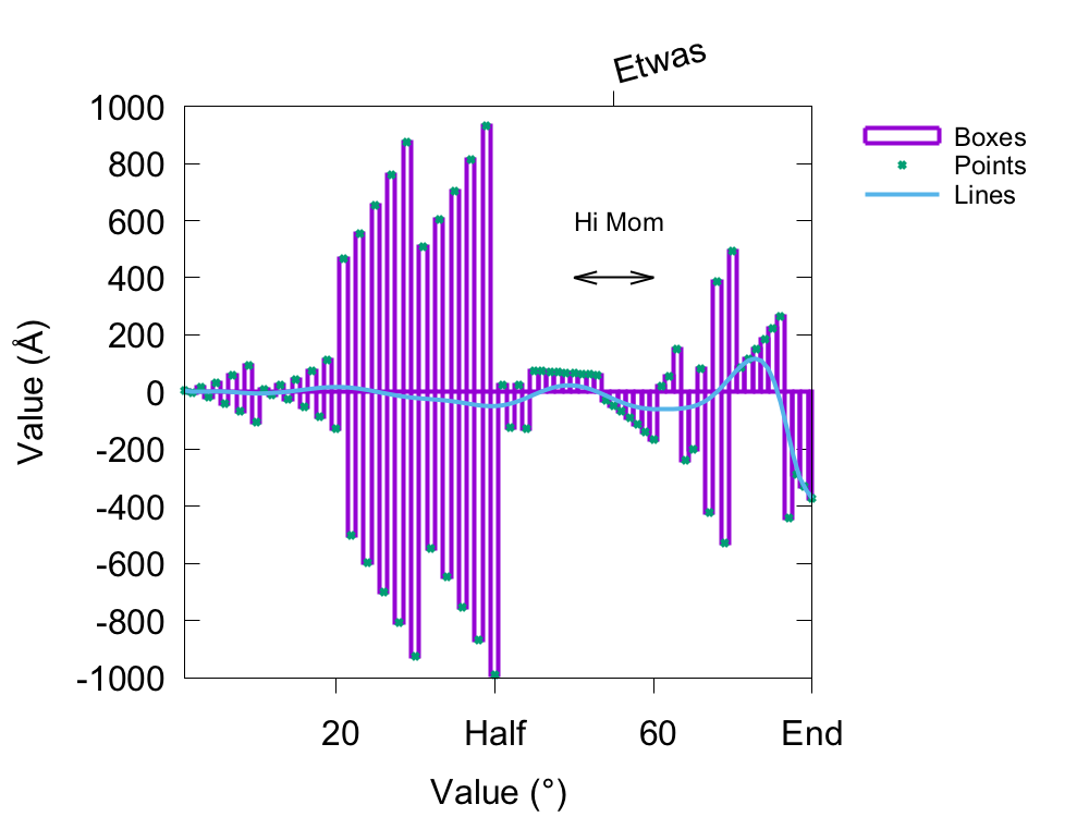
The following was the script used to create the above image.
set encoding iso_8859_1
#set term postscript enhanced color font "Arial,24";
set terminal pngcairo enhanced color font "Arial,24" size 1000,750;

set xlabel "Value ({\260})"
set ylabel "Value ({\305})"
set xrange [1:80]
set key outside right Left reverse width 2 height 1 font "Arial,18" maxrows 3

set xtics ("Start" 0, 20, "Half" 40, 60, "End" 80) border nomirror out;
set x2tics border nomirror out rotate by 15 ("Etwas" 55)

set arrow 1 from first 50,400 to first 60,400 lw 2 heads
set label "Hi Mom" at 50,600 font ",18"

set output "test-image.png";
plot "test.dat" u ($1):($2) w boxes t "Boxes" lw 4, \
"test.dat" u ($1):($2) w points t "Points" lw 4, \
"test.dat" u ($1):($2) w lines s bezier t "Lines" lw 4;
Something that’s been danced around a little bit so far is the idea of using transparent colors with pngcairo. Because of how gnuplot plots information like someone makes a sandwich (bread, cover the bread with peanut butter, hide the peanut butter with bananas, hide the bananas with more bread), data sets can be completely obscured from the seen plot. That’s where transparency comes in!
Colors can be made transparent by adding two characters to the beginning of the color’s HEX code. These two numbers correspond to the percentage of transparency. The thought process is flipped for gnuplot, though. If you use what would be 100%, that means that it’ll be 100% transparent, and not 100% opaque. The characters to add to the HEX code are based on multiplying the 255 rgb scale number by the percentage, and then converting that number to hexadecimal. Lucky for you, I’ve put them in the below table for you.
Table: Hexadecimal transparency characters
Where 100% is 100% transparent and 0% transparent has a “00” HEX code.
| Percentage (%) | HEX | (%) | HEX | (%) | HEX | (%) | HEX |
|---|---|---|---|---|---|---|---|
| 100 | FF | 75 | BF | 50 | 80 | 25 | 40 |
| 95 | F2 | 70 | B3 | 45 | 73 | 20 | 33 |
| 90 | E6 | 65 | A6 | 40 | 66 | 15 | 26 |
| 85 | D9 | 60 | 99 | 35 | 59 | 10 | 1A |
| 80 | CC | 55 | 8C | 30 | 4D | 5 | 0D |
One working set of commands for incorporating transparency can be seen below.
The box is set to allow transparency, then circles are used.
The first thing plotted is completely opaque, so it’s HEX code starts with 00.
The next thing plotted has a specified solid fill of 15%, but it also has 20%
transparency given by a HEX value of 33.
set style fill transparent solid 1.0 noborder
set style circle radius 0.02
plot ... lt rgb "#0000FF7F", \
... lt rgb "#339400D3" fs solid 0.15, \
Different weights and dash or point types can be used through setting lw
(line weight) and either dt (dashtype) or pt (point).
Again, gnuplot tends to cycle through a cycle of predetermined numbers and
colors, but you can respecify anything in the plot command.
You can even define dashtypes with any string containing dots, hyphens,
underscores, and spaces (dt “ .. -- __ “). There are also plenty of point
types (something like 75).
Some examples of the different weights, dashes, and points are shown in the
following images.
An abbreviated example of the script to generate both graphs would be:
set key bottom right font "Arial,18"

set output "test-line.png";
plot "test-line.dat" u ($1):($2-10) w lines s bezier t "dt 1 lw 1" lt 1 lw 1 dt 1, \
"test-line.dat" u ($1):($2-8) w lines s bezier t "dt 2 lw 2" lt 2 lw 2 dt 2;

set key box top left font "Arial,18" width -1 maxrows 6

set output "test-point.png";
plot "test-line.dat" u ($1):($2+40) w points t "pt 1" pt 1 lw 4, \
"test-line.dat" u ($1):($2+43) w points t "pt 2" pt 2 lw 4;