This example will use the preloaded dataset Theoph, which has data from an experiment on the pharmacokinetics of the respiratory drug thephylline. By using head on this dataset, we can see what the columns are coded as.

> head(Theoph, n = 1)
	Subject	Wt	Dose	Time	conc
1	1	79.6	4.02	0	0.74

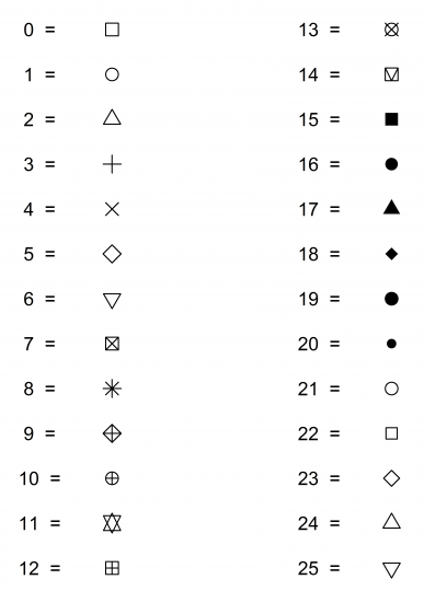
Knowing how the columns are coded allows you to reference certain columns in the data set using dataset$columnname. With the plot command, you can designate where the data are (in the following example, the x-axis is Theoph$Time and the y-axis is Theoph$conc. Using xlab and ylab sets the axes labels, and pch chooses the marker type (seen here).

> setwd("~/Desktop")
> png(filename="theophscatter.png")
> plot(Theoph$Time, Theoph$conc, xlab="Time (min)", ylab="Concentration (M)", pch=16)
> title("Pharmacokinetics of Theophylline")
> dev.off()
quartz
     2
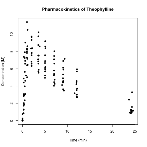
The x-axis is time in minutes. The y-axis is concentration in molarity.
The title is Pharmacokinetics of Theophylline. The data start at (0,0), before
rising between concentration of 6 and 10. They slowly fall until about the 13
minute mark. There are then points around 23 minutes close to 2 M.
A scatterplot created using the Theoph dataset.

Figure: Marker types

Depictions of the different marker types for 0 to 25.
0: white box
1: white circle
2: white triangle
3: cross
4: X
5: white diamond
6: inverted white triangle
7: box with X
8: asterisk
9: diamond with cross
10: circle with cross
11: Star of David
12: box with cross
13: white circle with X
14: white box with V
15: black box
16: black circle
17: black triangle
18: black diamond
19: black circle bigger than 16
20: black circle smaller than 16
21: white circle bigger than 1
22: white square smaller than 0
23: white diamond smaller than 5
24: white triangle smaller than 2
25: inverted white triangle smaller than 6.
Different marker options available, with the default equal to pch=1.