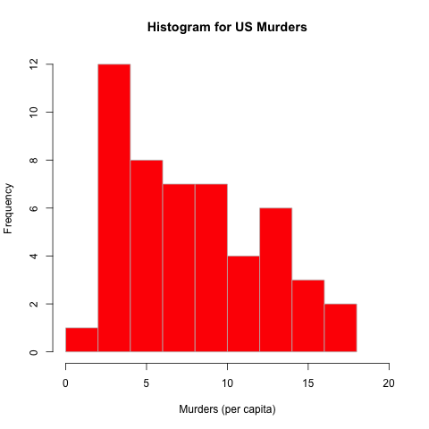
A histogram provides a visual depiction of a dataset’s distribution. This example uses the dataset USArrests, which contains information on the violent crime rates by US state.
> setwd("~/Desktop")
> png(filename="hist_murder.png")
> hist(USArrests$Murder,main="Histogram for US Murders",xlab="Murders (per capita)",border="gray",col="red",xlim=c(0,20))
> dev.off()
null device
          1

Because there were multiple columns of information, the Data$Column option
was used to specify which column the histogram should be created from.
The title was set using main=, colors for the border (border="gray") and
columns (col="red") were set, and the x-axis boundries were chosen as 0-20
(xlim=c(0,20)).
None of the options were necessary, except the initial Data\$Column
specification.
There are also more options for histograms found in the documentation,
including adding breaks (which can organize how data is grouped) or
density curves.