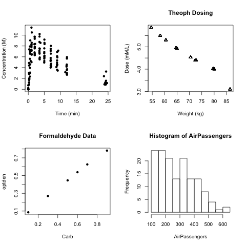
R lets you graph multiple data sets in one composed figure.
This is done through the par command.
Using par, you can specify a matrix (in the examples case, 2x2), where images
are added from top left to top right, bottom left to bottom right.
Each one can be formatted as previously described.
The example used three different sets of pre-loaded data,
and the very first graph is the only one without a specified title.
> setwd("~/Desktop")
> png(filename="random_data_R.png")
> par(mfrow=c(2,2))
> plot(Theoph$Time, Theoph$conc, xlab="Time (min)", ylab="Concentration (M)", pch=16)
> plot(Theoph$Wt, Theoph$Dose, xlab="Weight (kg)", ylab="Dose (mM/L)", pch=2, main="Theoph Dosing")
> plot(Formaldehyde, xlab="Carb", ylab="optden", pch=16, main="Formaldehyde Data")
> hist(AirPassengers)
> dev.off()
quartz
     2

par.